My Artwork Corner
Design II - Week 1
Home
DDSC-Week 2
Designing Digital Scrapbook Components
Digital Photography 1
Digital Photography 2
Digital Photography 3
Digital Photos 4
My Digital Gallery
Digital Gallery 2
Digital Gallery 3
Cartooning with Vector Graphics
Vector Graphics Week 2
Vector Graphics..Week 3
Vector Graphics..Week 4
Vector Graphics - Week 5
Vector Graphics - Week 6
Cartooning With Vector Graphics II - Week 1
Week 2
Week 3
Week 4
Week 5
PSP 8 Custom Brushes
Custom Brush - Week 2
Custom Brush - Week 3
Custom Brush - Week 4
Custom Brush - Week 5
Custom Brush - Week 6
PSPIZ Challenge
Memory Page Fundamentals
Memory Pages-Week 2
Memory Pages-Week 3
Memory Pages-Week 4
Memory Page-Week 5
Memory Page-Week 6
Paint Shop Pro 8 Effects
PSP 8 Effects-Week 2
PSP8 Effects-Week 3
PSP 8 Effects-Week 4
PSP 8 Effects - Week 5
PSP 8 Effects - Week 6
PSP Out of the Box
PSP Out of the Box-Week 2
PSP OTB- Week 3
PSP Out of the Box-Week 4
PSP Out of the Box-Week 5
PSP Out of the Box - Week 6
Design I-Elements & Principles
Design I - Design Principles, Visual Organization
Design 1-Grouping, Emphasis, Alignment & Rythm
Design I-Contrast & Consistency
Design I - Unity & Balance
Design I - Typography
Memory Page Design - Week 1
Memory Page Design-Week 2
Memory Pages-Week 3
Memory Page Design - Week 4
Memory page Design-Week 5
Memory page Design-Week 6
Design II - Week 1
Design II-Week 2
Design II - Week 3
Design II - Week 4
Design II-Week 5
designclass2wk1topost.jpg

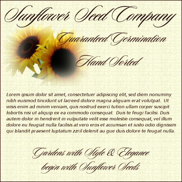
This week we reviewed the design elements & principles from Design 1 class and redid the first ad copy from that class.  I kept this one simple, letting  typography add to the design, adding the sunflowers as the company's logo and keeping the colors neutral yet warm and inviting.  I like it better than my first one as I think this is clean and easy to assimilate, attract the readers and stand out in the magazine so it wouldn't be overlooked (well, I can hope *G*)  I think it creates a visual road map for the reader, and is easy to scan, skim and scour, and attract the mature aduience it is looking for.   

This is the link to the website this week.  I love their magazine (just got my first issue a few weeks ago) and their site is easy to navigate, easy to read and their magazine is fantastic.  Their site home page is clean, with a good visual road map and easy to scan, skim and scour.