My Artwork Corner
Design II - Week 3
Home
DDSC-Week 2
Designing Digital Scrapbook Components
Digital Photography 1
Digital Photography 2
Digital Photography 3
Digital Photos 4
My Digital Gallery
Digital Gallery 2
Digital Gallery 3
Cartooning with Vector Graphics
Vector Graphics Week 2
Vector Graphics..Week 3
Vector Graphics..Week 4
Vector Graphics - Week 5
Vector Graphics - Week 6
Cartooning With Vector Graphics II - Week 1
Week 2
Week 3
Week 4
Week 5
PSP 8 Custom Brushes
Custom Brush - Week 2
Custom Brush - Week 3
Custom Brush - Week 4
Custom Brush - Week 5
Custom Brush - Week 6
PSPIZ Challenge
Memory Page Fundamentals
Memory Pages-Week 2
Memory Pages-Week 3
Memory Pages-Week 4
Memory Page-Week 5
Memory Page-Week 6
Paint Shop Pro 8 Effects
PSP 8 Effects-Week 2
PSP8 Effects-Week 3
PSP 8 Effects-Week 4
PSP 8 Effects - Week 5
PSP 8 Effects - Week 6
PSP Out of the Box
PSP Out of the Box-Week 2
PSP OTB- Week 3
PSP Out of the Box-Week 4
PSP Out of the Box-Week 5
PSP Out of the Box - Week 6
Design I-Elements & Principles
Design I - Design Principles, Visual Organization
Design 1-Grouping, Emphasis, Alignment & Rythm
Design I-Contrast & Consistency
Design I - Unity & Balance
Design I - Typography
Memory Page Design - Week 1
Memory Page Design-Week 2
Memory Pages-Week 3
Memory Page Design - Week 4
Memory page Design-Week 5
Memory page Design-Week 6
Design II - Week 1
Design II-Week 2
Design II - Week 3
Design II - Week 4
Design II-Week 5
designii-week3.jpg

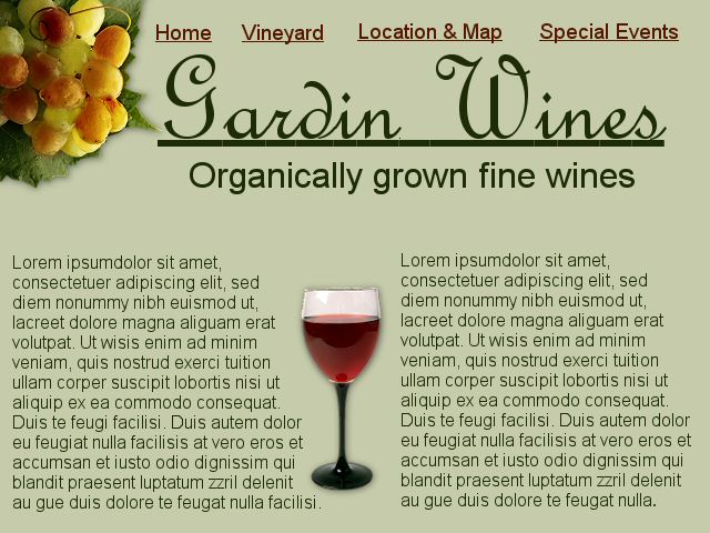
 Using colors as well as pictures, I tried to create the visuals to lead the viewer/reader through this web page.  the grapes to the left are green with a touch of red, and along the top are the links in red.  The background, title and lettering are in shades of green to keep it easy on the eyes and easy to follow.  The red in the grapes, the links at the top and the glass of wine as a divider leads the reader through the page.  I think this has good visual gravity with nothing overwhelming.

 
Getty Images is my website of choice this week.  I like the white background, with their visuals (pictures) about one-third of the way down. The larger graphic is attention grabbing, while they have a smaller one to the left. Their use of visuals, as well as the flow of the home page make it very appealing and easy to navigate.