|
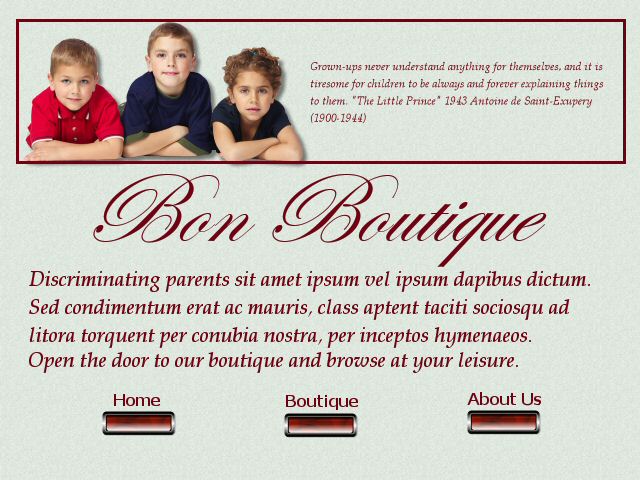
Scan, Skim and Scour...What I was trying for here was plenty of white
space with the muted background, yet with bold but not overpowering colors (scan); this easily lets you know
what the site is about with the picture and company name standing out (skim); and then a short paragraph
to confirm the content with an invitation to enter the site (scour).
************************************************************************************
For the ad this week, I chose this one:
I found the colors and white (negative) space visually pleasing (scan) with the pictures
and title easily letting me know (skim) if it was of interest to me to read it further (scour). I like the links at the left
which direct you to your interests without having to go through pages of items that you may not be interested in. I find it
visually pleasing and easy to read and understand.
|