| Sunflower Premium Seeds |
|
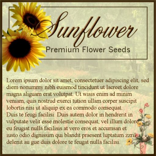
| 5X5 ad for print |
For this ad, I wanted to use the elements and principles from the lesson to emphasize the company
name, and as it is going in an upscale gardening magazine to convey the idea of a manicured flower garden by using a picture
in the background then muting it so the print was legible and easy to read. The smaller box around the name highlights
it, while the larger box around the ad draws it all together. The bouquet at the bottom was used to convey an elegant
cut flower arrangement from the garden; as sunflowers tend to make one think of "country" instead of elegance, and it combines
the earth tone colors.
For the ad this week, I chose this one:
The mass in this design I think, starts with the earthtone colors and texture in the background which "highlight" the plant
and then the lines lead to the information. How the elements were used makes it a visually pleasing and informative
ad.
|