|
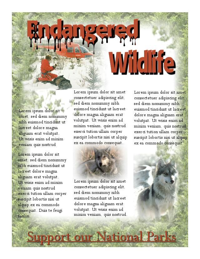
When I started on this, I wasn't sure what I was going to do with grids or a design. Once I got the pictures,
picked the grid, it just seemed to go from there with a little help from me. This has the eye catching title, with the
pictures used consistently for unity. I feel all of the images harmonize well with the feel of the design with ample
white space. I changed it a little from the original grid lay out. It could be used without the pine border, too;
but I left it in as I felt it added to the whole feel of the design.
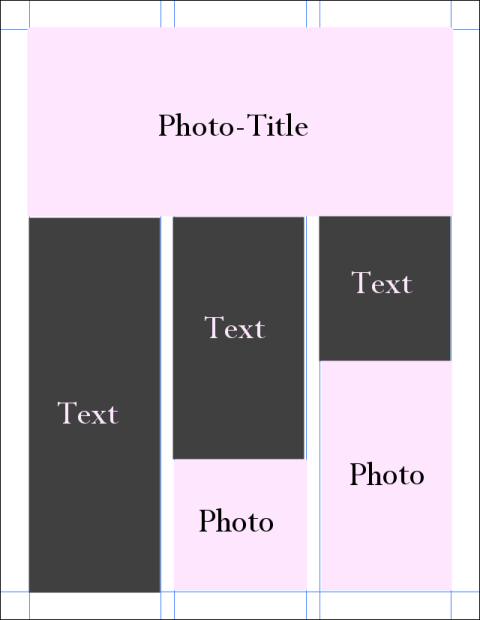
| The Layout |
|
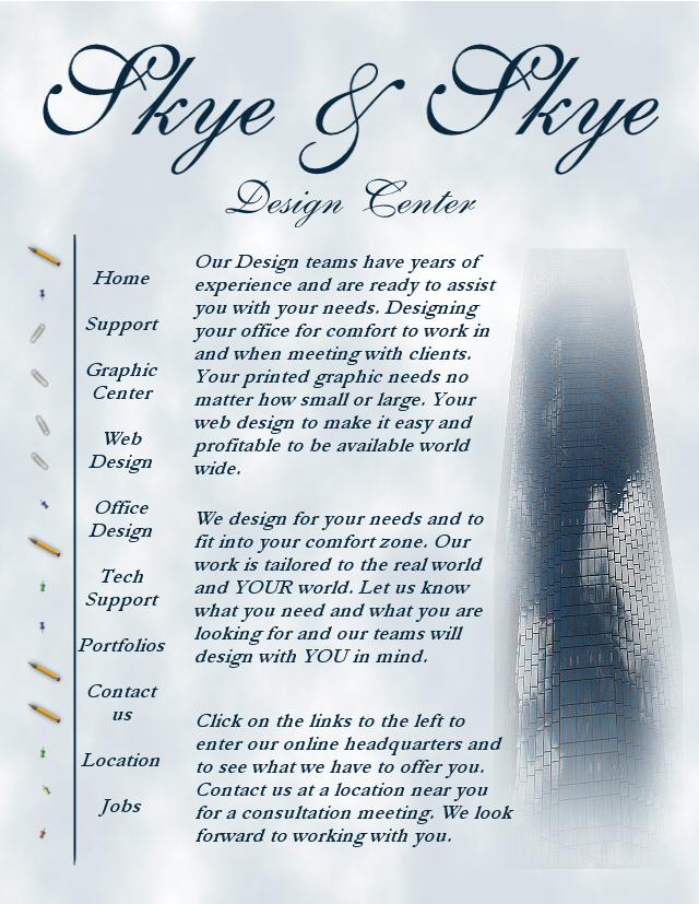
I had so much fun with the first one, I had to try another one. This is for a home page on a web site, and different
from anything I have done. I had the picture of the building which I had taken because I loved the way the clouds showed
in the glass. So this is what I did with it..kind of different, yet I feel it is pleasing and uses the design principles
for white space, scan, skim, scour along with consistency and unity.
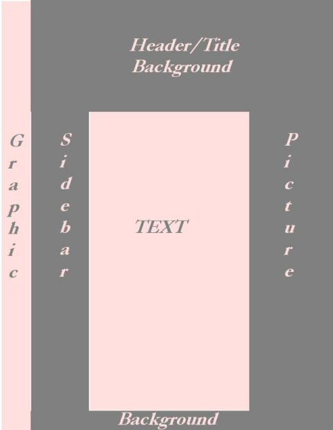
| Grid Layout |
|
|