My Artwork Corner
Design I - Unity & Balance
Home
DDSC-Week 2
Designing Digital Scrapbook Components
Digital Photography 1
Digital Photography 2
Digital Photography 3
Digital Photos 4
My Digital Gallery
Digital Gallery 2
Digital Gallery 3
Cartooning with Vector Graphics
Vector Graphics Week 2
Vector Graphics..Week 3
Vector Graphics..Week 4
Vector Graphics - Week 5
Vector Graphics - Week 6
Cartooning With Vector Graphics II - Week 1
Week 2
Week 3
Week 4
Week 5
PSP 8 Custom Brushes
Custom Brush - Week 2
Custom Brush - Week 3
Custom Brush - Week 4
Custom Brush - Week 5
Custom Brush - Week 6
PSPIZ Challenge
Memory Page Fundamentals
Memory Pages-Week 2
Memory Pages-Week 3
Memory Pages-Week 4
Memory Page-Week 5
Memory Page-Week 6
Paint Shop Pro 8 Effects
PSP 8 Effects-Week 2
PSP8 Effects-Week 3
PSP 8 Effects-Week 4
PSP 8 Effects - Week 5
PSP 8 Effects - Week 6
PSP Out of the Box
PSP Out of the Box-Week 2
PSP OTB- Week 3
PSP Out of the Box-Week 4
PSP Out of the Box-Week 5
PSP Out of the Box - Week 6
Design I-Elements & Principles
Design I - Design Principles, Visual Organization
Design 1-Grouping, Emphasis, Alignment & Rythm
Design I-Contrast & Consistency
Design I - Unity & Balance
Design I - Typography
Memory Page Design - Week 1
Memory Page Design-Week 2
Memory Pages-Week 3
Memory Page Design - Week 4
Memory page Design-Week 5
Memory page Design-Week 6
Design II - Week 1
Design II-Week 2
Design II - Week 3
Design II - Week 4
Design II-Week 5
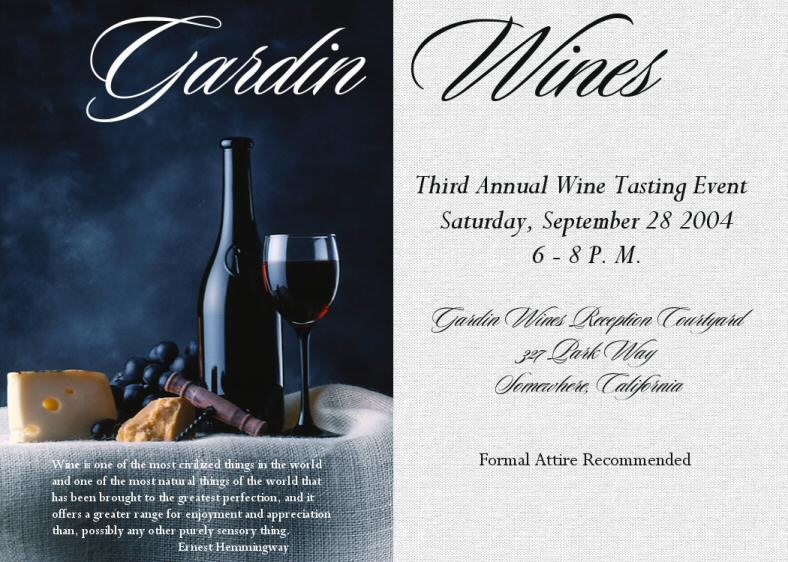
Large card invitation
designweek5topost.jpg

italcorkprintadforsample2.gif

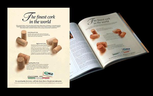
I chose this ad as I think it covers the design principles we have learned.  It has visual organization, rhythm, contrast, consistency, unity and balance.    The contrast is good, and the consistency keeps us moving through the ad after the original scanning and skimming to really read it. The grouping highlights the text message and gives it emphasis.  Good use of white space to "rest" the eyes and good use of the "optical center" for information.