My Artwork Corner
Design I-Contrast & Consistency
Home
DDSC-Week 2
Designing Digital Scrapbook Components
Digital Photography 1
Digital Photography 2
Digital Photography 3
Digital Photos 4
My Digital Gallery
Digital Gallery 2
Digital Gallery 3
Cartooning with Vector Graphics
Vector Graphics Week 2
Vector Graphics..Week 3
Vector Graphics..Week 4
Vector Graphics - Week 5
Vector Graphics - Week 6
Cartooning With Vector Graphics II - Week 1
Week 2
Week 3
Week 4
Week 5
PSP 8 Custom Brushes
Custom Brush - Week 2
Custom Brush - Week 3
Custom Brush - Week 4
Custom Brush - Week 5
Custom Brush - Week 6
PSPIZ Challenge
Memory Page Fundamentals
Memory Pages-Week 2
Memory Pages-Week 3
Memory Pages-Week 4
Memory Page-Week 5
Memory Page-Week 6
Paint Shop Pro 8 Effects
PSP 8 Effects-Week 2
PSP8 Effects-Week 3
PSP 8 Effects-Week 4
PSP 8 Effects - Week 5
PSP 8 Effects - Week 6
PSP Out of the Box
PSP Out of the Box-Week 2
PSP OTB- Week 3
PSP Out of the Box-Week 4
PSP Out of the Box-Week 5
PSP Out of the Box - Week 6
Design I-Elements & Principles
Design I - Design Principles, Visual Organization
Design 1-Grouping, Emphasis, Alignment & Rythm
Design I-Contrast & Consistency
Design I - Unity & Balance
Design I - Typography
Memory Page Design - Week 1
Memory Page Design-Week 2
Memory Pages-Week 3
Memory Page Design - Week 4
Memory page Design-Week 5
Memory page Design-Week 6
Design II - Week 1
Design II-Week 2
Design II - Week 3
Design II - Week 4
Design II-Week 5
designwk4buspkgtopost.jpg

designwk4terrabakerypost.jpg

Ad for Analysis
whiteadprintadcopyforinspiration.jpg

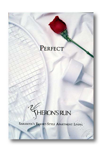
I really like this ad for Heron's Run.  It is beautiful in it's simplicity, yet it has contrast, visual interest and easily scanned, skimmed and scoured. Less is more in this case as with very few words the ad sparks interest and tells the story. The red rose at the top attracts the viewer, then you can easily see what the ad is for and the contrast, consistency and texture tell you volumes about Heron's Run.