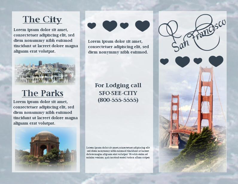
On this brochure, I tried to keep it simple, letting pictures say more than words. Of course, I chose the Golden
Gate Bridge for the cover (I wish I could say I took that picture...but I didn't. It was a sample picture in my picture
folder). I chose the hearts as everyone knows they leave their heart in San Francisco....or I'm dating myself by knowing
that song. <G>
I chose the overall view of the city for one picture, to communicate the residential as well as the "big city" feel.
The parks to convey relaxing and places to explore, play and bring the children. I wanted to show some of the beauty
of the city, along with a few words to entice people to visit as this is more for the tourist. Now that I write this
I want to re-do it as there is so much more here. :))
I did struggle with this a little, but only because I had a hard time getting through my head what goes where so when folded
it would be right. (A mind like a steel trap...........rusted shut!)