My Artwork Corner
Design I - Typography
Home
DDSC-Week 2
Designing Digital Scrapbook Components
Digital Photography 1
Digital Photography 2
Digital Photography 3
Digital Photos 4
My Digital Gallery
Digital Gallery 2
Digital Gallery 3
Cartooning with Vector Graphics
Vector Graphics Week 2
Vector Graphics..Week 3
Vector Graphics..Week 4
Vector Graphics - Week 5
Vector Graphics - Week 6
Cartooning With Vector Graphics II - Week 1
Week 2
Week 3
Week 4
Week 5
PSP 8 Custom Brushes
Custom Brush - Week 2
Custom Brush - Week 3
Custom Brush - Week 4
Custom Brush - Week 5
Custom Brush - Week 6
PSPIZ Challenge
Memory Page Fundamentals
Memory Pages-Week 2
Memory Pages-Week 3
Memory Pages-Week 4
Memory Page-Week 5
Memory Page-Week 6
Paint Shop Pro 8 Effects
PSP 8 Effects-Week 2
PSP8 Effects-Week 3
PSP 8 Effects-Week 4
PSP 8 Effects - Week 5
PSP 8 Effects - Week 6
PSP Out of the Box
PSP Out of the Box-Week 2
PSP OTB- Week 3
PSP Out of the Box-Week 4
PSP Out of the Box-Week 5
PSP Out of the Box - Week 6
Design I-Elements & Principles
Design I - Design Principles, Visual Organization
Design 1-Grouping, Emphasis, Alignment & Rythm
Design I-Contrast & Consistency
Design I - Unity & Balance
Design I - Typography
Memory Page Design - Week 1
Memory Page Design-Week 2
Memory Pages-Week 3
Memory Page Design - Week 4
Memory page Design-Week 5
Memory page Design-Week 6
Design II - Week 1
Design II-Week 2
Design II - Week 3
Design II - Week 4
Design II-Week 5

designclasswk6topost.jpg

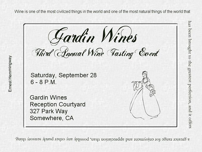
This week we learned about typography, and I redesigned this invitation using only fonts.
 
The script font is easy to read for the 2 lines it is used on and also adds a decorative touch to this invitation. I then used a sans serif font for the important information which includes the date time and location of this event so it would be easily readable, and keeping in mind the rule of thirds and where the eyes come to rest.  The ding font was used again for decorative purposes and also to "point" the reader back to the important information. 
 
The quote I added as a border around the invitation as it is fun to read, but not a necessary part of the invitation.  I see now that on a web page it is impossible to read the bottom line..this was made as a post card and I was thinking people could turn it to read that line.  Kind of difficult to stand on your head to read it here..(smiles)  This was fun to do and experiement with.